British Rail 1963–1966

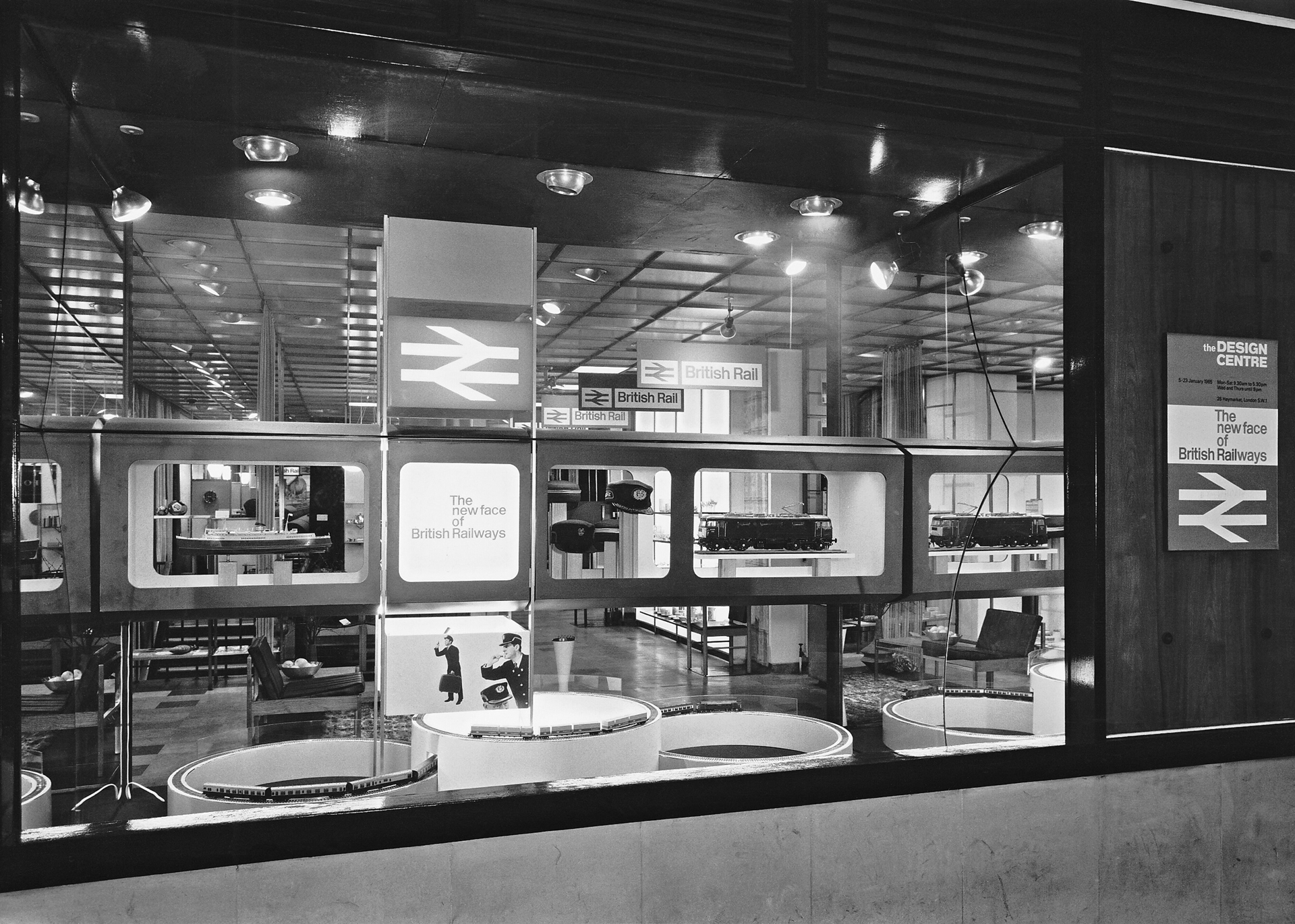
The corporations name was shortened from British Railways to British Rail; Gerald Barney’s two-way arrow became the new emblem for British Rail and the first issue of its Corporate Identity Manual was released in 1965, giving detailed instructions for applying the logo and identity across all aspects of the business from train liveries and station signage, to staff uniforms and crockery. The identity was launched with an exhibition ‘The New Face of British Railway’ at the Design Centre.
The Rail Alphabet typeface was spaced on ‘tiles’ to ensure a consistent compact arrangement; whilst station signs used a stacked ‘plank system’ concept which allowed for mass-manufacture, cost effectiveness and ease of maintenance across the whole network.
As well as the signage and appearance of 2,000 stations, 4,000 locomotives, 23,000 passenger carriages and 45 Sealink ships were also repainted in its implementation.
Despite British Rail’s services now being franchised to private sector operators, the original signage is still present in many stations, whilst the British Rail symbol can still be seen on every station façade and every ticket.
![]()
![]()
You're looking for exceptional architecture. We're looking for exceptional projects. Let's start a conversation
Enquire
