ILFORD 1946 & 1966

During the 1960s and 70s DRU came to represent a British design establishment.
In 1966 the Unit was commissioned to carry out their second corporate identity programme for the photographic company, Ilford, following the original identity scheme designed by Milner Gray back in 1946. This second programme incorporated a new ‘starburst’ logo, created by Ronald Armstrong. The scheme covered over 18,000 products from cameras, films and paper to chemicals and vehicle livery.
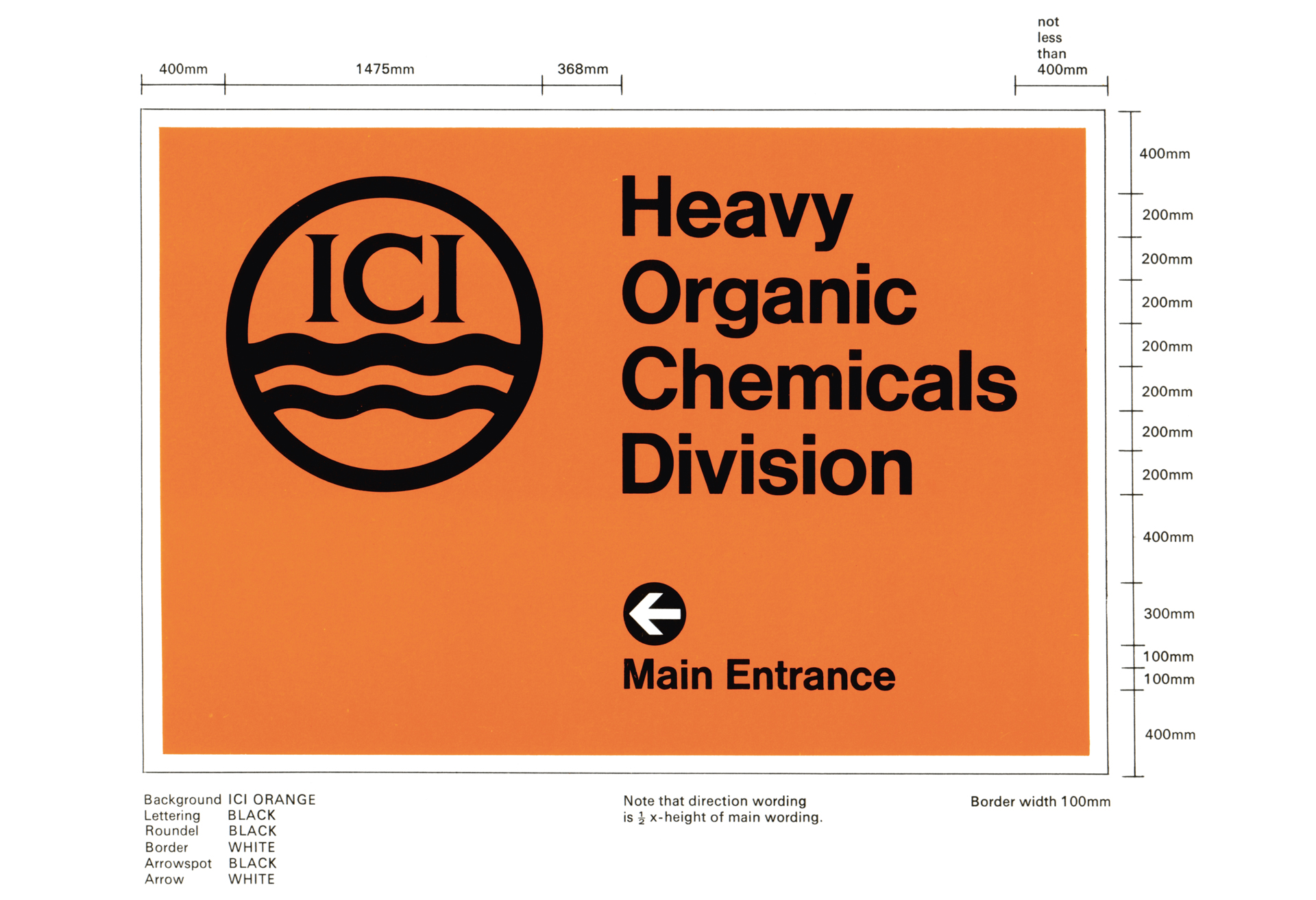
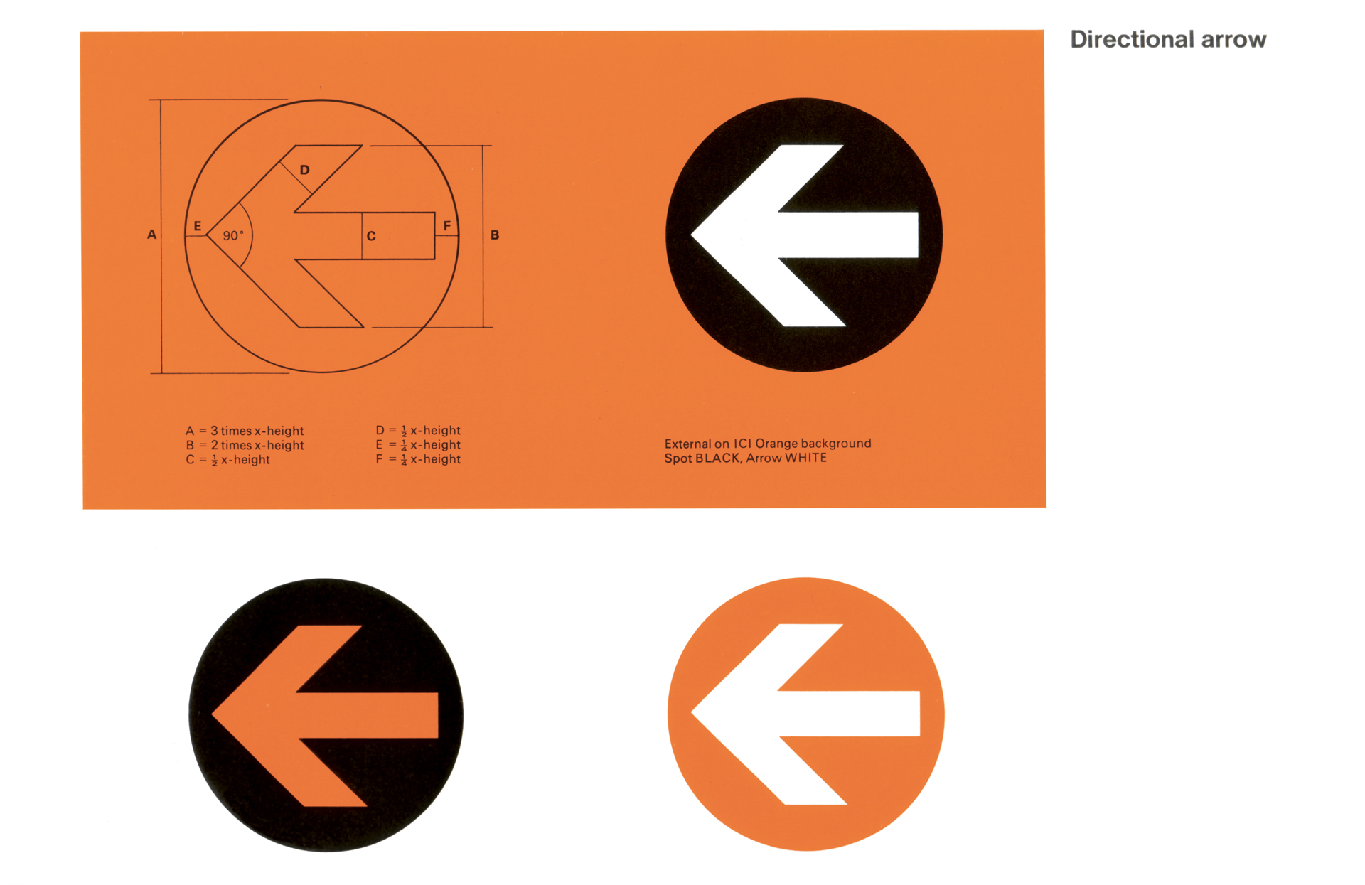
In that same year, DRU commenced work for the country’s largest commercial enterprise, Imperial Chemical Industries (ICI). The corporate identity design programme by Ronald Armstrong and Milner Gray saw modifications to the ICI Trademark and orange designated the ICI colour. Helvetica became the standard ICI alphabet for use on stationery and a range of pictogram warning and information signs were created.
You're looking for exceptional architecture. We're looking for exceptional projects. Let's start a conversation
Enquire
